The Complete Guide to Colour Theory and How to Pick the Correct Colours for Your Website

Colour Theory - Why it's Important
Colour theory is a fundamental aspect of design that can make or break a project. It encompasses the use of colour in all its forms, including hues, shades, and tints, and is essential to creating effective and impactful designs. Whether you’re working on a web design, print design, or graphic design project, understanding colour theory is crucial for achieving your desired aesthetic. In this post, we’ll delve into the basics of colour theory and explore how to apply it in your web design projects for maximum impact.
Hue, shade and tint?
Hue refers to the pure, primary colour on the colour wheel. For example, red, blue, and yellow are all hues.
Shade refers to a hue that has black added to it, resulting in a darker version of the colour. For example, a deep red would be considered a shade of red.
Tint refers to a hue that has white added to it, resulting in a lighter version of the colour. For example, a pastel red would be considered a tint of red.
So in simple terms, hue refers to the basic colour, shade refers to the darkened version, and tint refers to the lightened version of a colour. Understanding the difference between these three terms is essential for creating effective colour palettes and making strategic colour choices in design and branding.
RBG and CMYK Colour and why they matter to web designers or graphic designers?
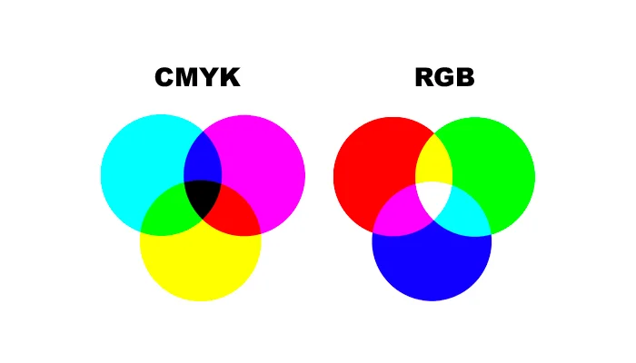
RGB and CYMK are two different colour models used in different contexts.
RGB (Red, Green, Blue) is an additive colour model used in digital displays, such as computer monitors and televisions. In this model, different intensities of red, green, and blue light are combined to create a wide range of colours. When all three colours are combined at their highest intensity, the result is white. When all three colours are turned off, the result is black. RGB is the colour model that your web developer or graphic designer will work with for web work.
CYMK (Cyan, Yellow, Magenta, Black) is a subtractive colour model used in printing. In this model, colours are created by subtracting certain wavelengths of light from a white background. The four colours used in the CYMK model (cyan, yellow, magenta, and black) are combined in various amounts to create a wide range of colours. The black ink, also known as the “key” colour, is used to create darker shades and to add depth and contrast to the final printed image. CYMK will be used by graphic designers for your logos and branding materials that are to be printed.
So in simple terms, RGB is used to create colours in digital displays and CYMK is used to create colours in printed materials. Understanding the difference between these two colour models is important for ensuring that your designs and images look consistent and accurate across different mediums.
Understanding the colour wheel and its basic principles in colour theory

The colour wheel is a fundamental tool in colour theory that allows designers to understand and experiment with different colour combinations. It’s a visual representation of the relationships between colours, with primary colours (red, blue, and yellow), secondary colours (orange, green, and purple), and tertiary colours (yellow-orange, red-orange, red-purple, blue-purple, blue-green, and yellow-green).
The basic principles of the colour wheel are colour harmony, saturation and contrast. A colour wheel is a tool that can be used to create a sense of visual harmony and balance in a design.
Harmony refers to the pleasing visual relationship between different colours. In other words, it’s the way in which different colours work together to create a balanced and aesthetically pleasing combination.
Saturation is the intensity or purity of a colour. High saturation means the colour is pure and intense, while low saturation means it is more muted and greyed.
Contrast is the degree of difference between colours. High contrast implies strong differences and low contrast implies weak differences.
Applying colour theory in design: colour combinations and schemes
Once you have a solid understanding of the colour wheel and its basic principles, you can start experimenting with different colour combinations and schemes in your design projects. There are several different types of colour schemes that you can use, each with its own unique feel and impact. Some popular colour schemes include:
Monochromatic: Using variations of a single colour
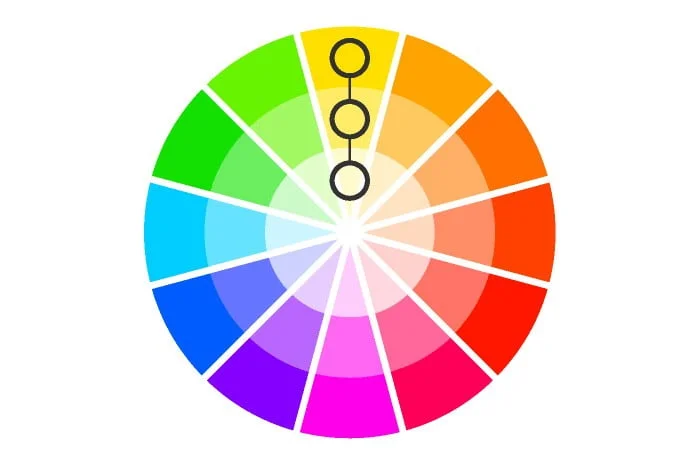
Analogous: Using colours that are next to each other on the colour wheel
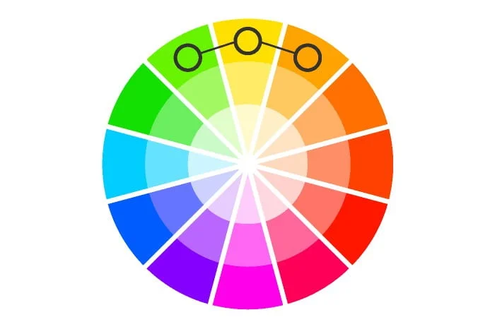
Complementary: Using colours that are opposite each other on the colour wheel

Triadic: Using colours that are evenly spaced around the colour wheel

Using Colour Psychology to Design a Compelling Website
Websites are one of the most powerful platforms for marketing, sales and branding. A website that is designed well has the power to compel people to take actions such as signing up for a mailing list, buying a product or downloading an e-book.
The colours we use on our website have a big impact on how people react. It’s not just about choosing colours that look nice together but also about choosing colours that will have the desired effect on your audience.
With colour psychology, you can create an aesthetically pleasing design which also communicates with your visitors in a way that will make them want to take the desired action. Different colours can evoke different emotions and associations in people and can impact how they perceive and respond to a brand or product. For example, blue is often associated with trustworthiness and reliability, while red is associated with excitement and energy. It’s important to understand the cultural significance of colour as well. For example, in Western cultures, white is associated with purity, while in Eastern cultures it is associated with death. Understanding the psychology of colour can help you make strategic choices in your branding and marketing efforts.
Red - Passion, love, anger, danger, warning, active, power

Orange - Warmth, energy, happiness, enthusiasm

Green - Nature, growth, health, harmony, money, balance, safety

Yellow - Sunshine, happiness, joy, intellect, caution

Blue - Calmness, trust, loyalty, wisdom. mystery

Purple - Royalty, luxury, creativity, mystery, fantasy, wealth

Pink - Innocence, femininity, compassion, love, care, calm

Black - Power, sophistication, mystery, evil

White - Purity, innocence, cleanliness, peace

Brown - Earthiness, reliability, dependability, friendliness

Silver - Modernity, sophistication, industrial, cold

Gold - Luxury, wealth, success, prestige, glamour.

How Colour Theory is Used in Web Design
Web designers use colour theory to create a visually appealing and effective website. It is important to choose the right colour palette, as the wrong choice can have a negative impact on the overall design and user experience.
A website’s colour palette should complement its overall aesthetic and branding, and also convey the desired emotions and tone. For example, a website for a financial institution may use cool and conservative colours, while a website for a children’s toy company may use bright and playful colours.
In web design, it’s also important to consider colour contrast, as this can impact the readability and accessibility of the website. A high contrast between the background and text colours makes the text more readable, while a low contrast can make it difficult for users to read the text. Certain colour combinations can make it difficult for people with colour blindness or other visual impairments to read or navigate the content of your website.
Tips for Choosing a Colour Palette for Your Website
Consider your brand’s colour palette and make sure that the colours you choose complement it.
Use a colour wheel to choose colours that complement each other and create a harmonious colour palette.
Experiment with different combinations and choose colours that evoke the desired emotions and tone.
Consider the colour contrast and make sure that the text is readable against the background colour.
Test your colour palette on different devices and in different lighting conditions to make sure that it looks good in different environments.
- Hire a professional web designer to do all the heavy lifting for you.
Additional resources
In conclusion, colour theory plays a crucial role in web design, as it helps to convey emotions and set the tone for a website. By understanding the fundamentals of colour theory and how it can be applied to web design, you can create a visually appealing and effective website that provides a memorable user experience.
Colorhunt – Premade colour palettes
Dribbble – Inspiration from the worlds best designers
Canva colour palette generator – Upload your logo and create a colour palette
