Ryder Building Group Website Redesign
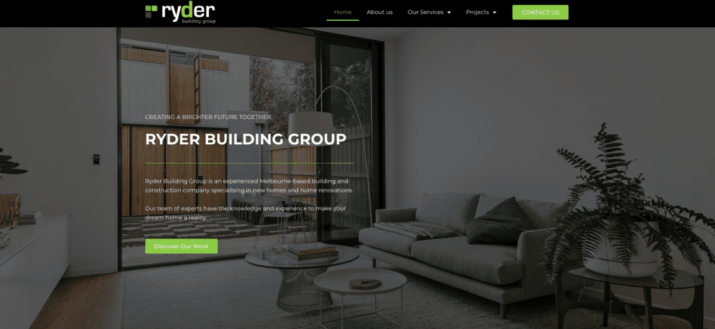
Recently, Matt Forbes Dev was tasked with redesigning the website of Ryder Building Group, a building and construction company based in Melbourne. The goal of the redesign was to create a modern, user-friendly website that accurately reflected Ryder Building Group’s brand and values.
Initial Inspection of Ryder Building Group Website
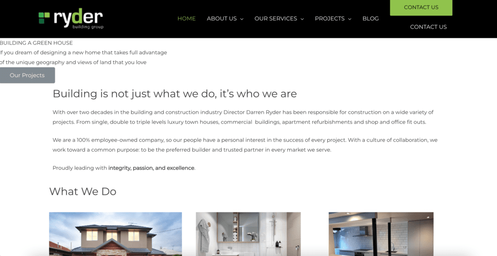
Upon initial inspection of Ryderbg.com.au it was evident that the website had not been maintained with regular website maintenance. There was a lack of ‘whitespace’ making the website feel cramped. Website copywriting lacked information and didn’t convey the value that Ryder Building Group can provide their customers. Navigation was poor with broken links. There were a number of pages that could be combined to increase page authority and reduce the overall amount of pages as some pages provided very little information. There was a blog page but no blog posts and the overall site architecture was unnecessarily complex for a website of this size.
Client consultation and development of project scope
Initial consultation with Ryder Building Groups Director, Darren Ryder was very positive. Darren’s company, Ryder Building Group, is on the rise and seeking to invest in his website to capture more leads and assist in onboarding his clients.
Darren wished to update Ryder’s portfolio to showcase a number of custom home builds that had recently been completed.
Darren understood that Ryderbg.com.au needed a redesign rather than some updates and general maintenance. There were issues with the website responsiveness on mobile devices and a number of outdated plugins potentially causing vulnerabilities.
Darren was seeking a modern website but it was important to maintain the established branding retaining colours, fonts and logos. The proposed project scope would provide value to Darren and Ryder Building Group with an increase in domain and page authority and an increase in organic traffic to the website.
Features of Ryder Building Groups new Website

The new website, available at ryderbg.com.au, features a sleek, minimalist design that is both easy on the eyes and easy to navigate. The homepage includes a large, high-quality image of one of Ryder Building Group’s completed projects, which immediately grabs the attention of visitors and helps to showcase the company’s capabilities.
The site’s main navigation menu is located at the top of the page, making it easy for visitors to find the information they need quickly. The menu is also organised logically, with categories such as “About Us,” “Our Services,” and “Projects” clearly defined and easy to access.
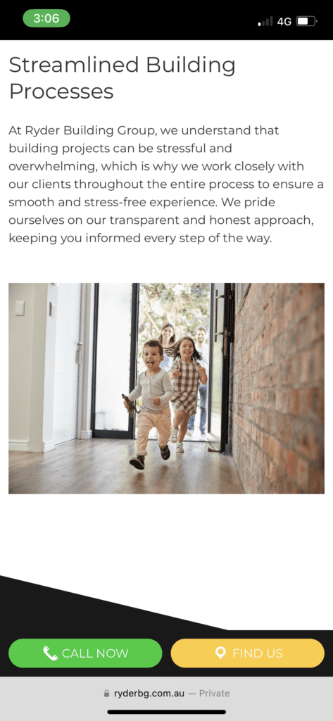
One of the standout features of the new Ryder Building Group website is its responsive design. The site is optimised for viewing on a wide range of devices, including desktops, laptops, tablets, and smartphones. This means that visitors can enjoy a seamless browsing experience no matter how they choose to access the site.
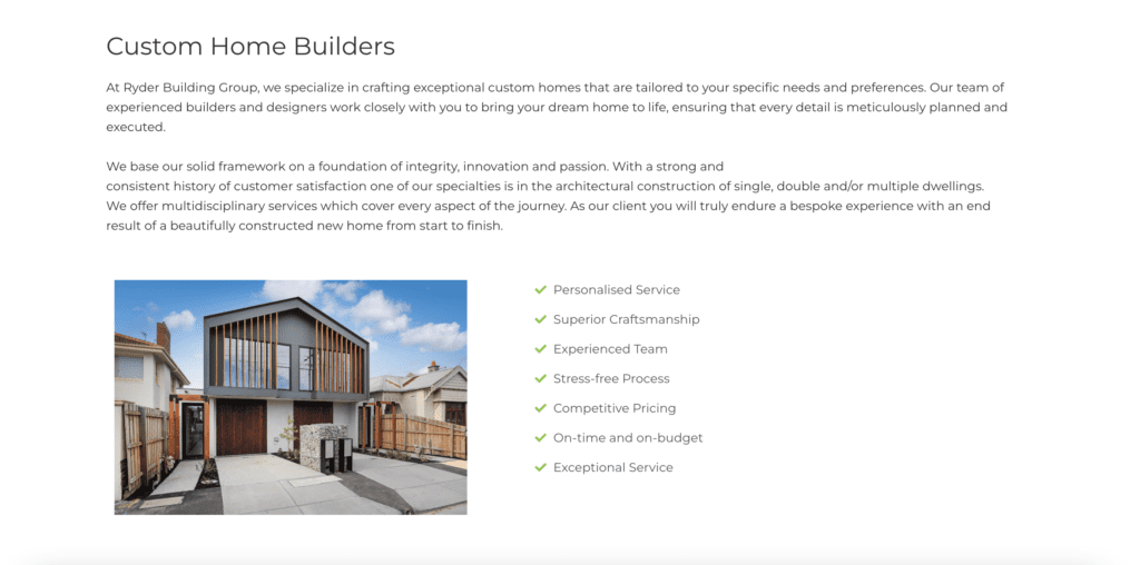
Another key feature of the new website is its emphasis on high-quality, engaging content. A number of pages that provided little value were combined and 301 redirects were established to prevent an SEO penalty. Each page on the site now includes clear, concise copy that accurately describes Ryder Building Group’s services and expertise.
Overall, the redesign of ryderbg.com.au by Matt Forbes Dev is a success. The new website effectively communicates Ryder Building Group’s brand and values, while providing a modern, user-friendly experience for visitors. With its responsive design, engaging content, and intuitive navigation, the site is sure to help Ryder Building Group continue to grow and thrive in the years ahead.
